
IRIS login | Reed College home Volume 90, No. 3: September 2011
Thinking Reed: Centennial Essays
Rescued from a Life of Crime (continued)
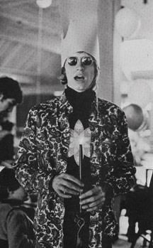
Chuck Bigelow, from 1967 Griffin.
For Lloyd Reynolds, calligraphy was not a mere decorative craft but literacy itself, the basis of civilization. His enthusiasms ranged from the scribes of ancient Sumer, who invented writing thousands of years before the Greeks borrowed the alphabet from the Phoenicians, to the artistry of Chinese calligraphers such as the third-century (CE) brush wizard Wang Xizhi, still admired today in China and Japan, to the medieval scholar-scribe Alcuin of York, who led the Carolingian Renaissance and helped devise and promulgate the ancestor of the basic Roman alphabetic script we use today.
Inspired by Reynolds, I later studied typography with Jack Stauffacher at the San Francisco Art Institute. Stauffacher, like Reynolds, was an enthusiast, but for the printed book, not the handwritten manuscript. From Jack, I learned of the great Venetian scholar-printer Aldus Manutius and his typefaces, and of their designer, Francesco Griffo of Bologna. Jack then asked me to be his teaching assistant, which led me deeper into a career in typography.
I admired Lloyd and Jack for their vision and enthusiasm, but I didn’t believe traditional explanations of calligraphic and typographic aesthetics, which seemed more like primitive belief systems than scientific understanding. So next I studied visual perception with Gerald Murch at Portland State University, from whom I learned theories of feature detectors and spatial frequency channels in the visual system. Though fascinating, those scientific theories did not offer practical guidance in matters of legibility and typographic aesthetics, or so I first thought.
Later, living and working in Cambridge, Massachusetts, I took a course on the physics of information at Harvard’s extension school. One evening, listening to a lecture on sampling theory, I realized how it corresponded to the theory of spatial frequency detection in the visual system, and how both theories explained some difficult technical and aesthetic problems of digitization of typographic letter forms. As a corollary, the same concepts explained some puzzles in the evolution of typographic forms.
I should emphasize that much of my insight was neither original nor subject to rigorous proof, but no one before had put the disparate pieces together in quite the same way to address technology, art, and cultural evolution. Donald Day ’68 (an old friend from Reed, who had also studied calligraphy with Reynolds) and I summarized these ideas in an article on digital typography for Scientific American. Published in 1983, it included calligraphic illustrations and diagrams by Kris Holmes ’72, who had studied calligraphy at Reed with Robert Palladino and Reynolds. All in all, a Reed production. As at Reed, we combined the pleasure of finding things out with the fun of sharing them.
倪
Yet, Kris Holmes and I weren’t satisfied merely to analyze such phenomena. We wanted to create forms to appeal to the senses as well as to the intellect (shades of Democritus). In 1982, we began the design of a new, original family of digital typefaces for laser printers and computer screens. There were no guidebooks or manuals, little information, and few tools. Every aspect of the design had to be determined by guesswork and experiment. It was a good thing we had learned at Reed to think outside the box. Of course some of our ideas turned out to be right, others to be irrelevant, and some to be wrong, but we kept innovating.
Several pundits in the field scoffed at our efforts. They knew the present and believed the future would be like it, only more so. But, one who encouraged us was world-famous type designer Hermann Zapf, with whom Kris and I had studied at the Rochester Institute of Technology. Zapf had been a pioneer designer of digital types for high-quality typesetting systems, and his encouragement helped us believe we were on the right track.
We named our new design “Lucida” from Latin lux (light) because it would be made out of light (laser, CRT, LCD, etc.) and was intended to be clear and rational. Although designed for computers, Lucida was not computeristic or nerdish in style. Mindful of Reynolds’ passionate insistence on the importance of handwritten forms, we looked back to Italian Renaissance handwriting and early Roman typefaces for our inspiration. We didn’t try to copy traditional forms directly; they wouldn’t have worked. Instead, we tried to distill their essential legibility and adapt them to the procrustean raster restrictions of digital displays and printers. We had to simplify, simplify, simplify, reducing forms to their bare essentials so they would still be readable and congenial in look, despite having been sliced and diced in a digital grid and rendered amid halos of extraneous noise.
Th
We showed the first printed specimen of Lucida in 1984 at a London meeting of the Association Typographique Internationale. By the middle of the next year, we had expanded it into seriffed and sans-serif families, including Roman, italic, and bold variations. Major manufacturers of digital printing software and hardware did not, however, immediately adopt it. Although innovative in technology, the big manufacturers were imitative in typography. Lucida fonts were first released by a small laser printer manufacturer, the Imagen Corporation, and were initially available on only a few hundred computer systems. Despite initial indifference and eventual fierce competition from large firms, we persevered, and in time the industry caught up with our designs. Today, Lucida fonts are available on several hundred million computers, in a greatly expanded family of styles and weights.
巴勒斯坦权力机构
And so what if digital media are making us illiterate? Is illiteracy really so bad? In the grand parade of human progress, illiterates invented toolmaking, agriculture, domestication of animals, weaving, pottery, wine making, poetry, and storytelling—all the arts and crafts of prehistory and much of what we think of as civilized arts today. Before the Odyssey was written down, Homer (or poets like him) entertained audiences by oral recital. Moreover, illiterates invented writing, or so it stands to reason. Who else could have done it? (Actually, the archaeological record suggests that the invention of writing was a long, slow process taking many generations.)
Web Special
Editor's Note
Features
- What is a Reedie, Anyway?
- A Kurdish Odyssey
- Rucked and Mauled
- Puppet Master
- Paying It Forward
- An Owl in the Hand Is Worth Two on the Head
- Herodotus and the Invention of History
- Rescued from a Life of Crime
- The Maestro
Reediana
Eliot Circular
- March of the Class of ’11
- President Diver Announces Retirement
- Reactor Gets New Director
- Reed Appoints First Dean for Institutional Diversity
- Our Fabulous Volunteers
- Our Brilliant Students
- Students Press Reed to Tackle Sexual Assault
Empire of the Griffin
Alumni Profiles
In honor of Reed’s 100th birthday, make your gift this year and pledge your continued support in the future.

REED MAGAZINE STAFF
EDITOR
503/777-7596
CLASS NOTES EDITOR
503/777-7591
WEB DESIGNER
503/459-4632
LATEST COMMENTS
steve-jobs-1976 I knew Steve Jobs when he was on the second floor of Quincy. (Fall...
Utnapishtim - 2 weeks ago
Prof. Mason Drukman [political science 1964–70] This is gold, pure gold. God bless, Prof. Drukman.
puredog - 1 month ago
virginia-davis-1965 Such a good friend & compatriot in the day of Satyricon...
czarchasm - 4 months ago
John Peara Baba 1990 John died of a broken heart from losing his mom and then his...
kodachrome - 7 months ago
Carol Sawyer 1962 Who wrote this obit? I'm writing something about Carol Sawyer...
MsLaurie Pepper - 8 months ago
William W. Wissman MAT 1969 ...and THREE sisters. Sabra, the oldest, Mary, the middle, and...
riclf - 10 months ago