Web Design Tips

Learn how to balance visual appeal, functionality, and accessibility to ensure our visitors can navigate, understand, and successfully use Reed's website.

Cascade's  components and  custom formats allow web producers to add visual interest and structural elements to Reed's web pages, but it's possible to go overboard. Using too many design features can overwhelm site visitors and make it harder for them to find the information they need. Follow these tips for ensuring web pages are recognizably Reed, user-friendly, and accessible.
Collage of Reed College webpages on desktop and mobile.

Tips for User-Friendly Design

Navigation and User Flow

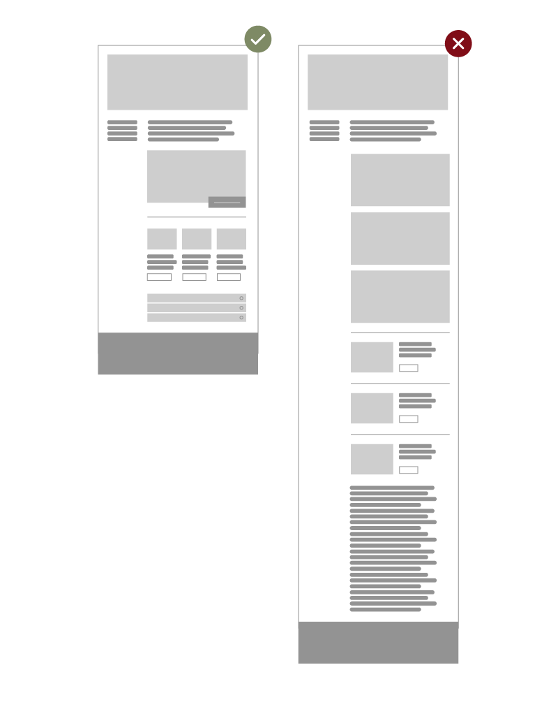
Simplify Navigation: Don't Make Users Think

Don't introduce questions with your layout. If the layout and structure aren’t intuitive, users will get confused, making it harder for them to find their way around. A clear, logical structure will help visitors navigate smoothly.

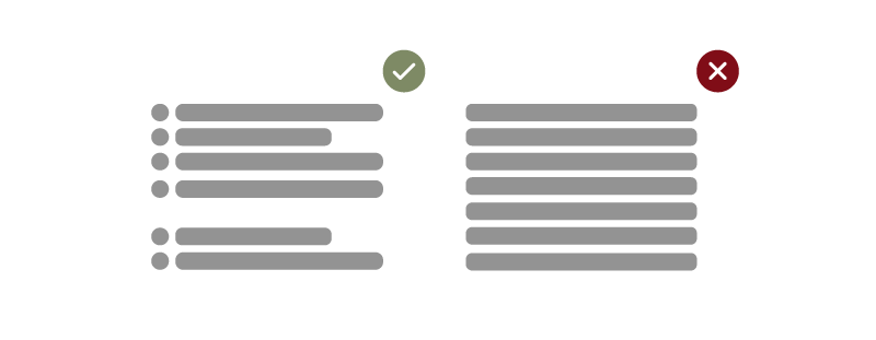
Focus Attention: Guide Users' Eyes Naturally

Make moderate use of components and visual elements in order to focus users’ attention on specific areas of the site without having to think about where they should look.

Two graphics depicting webpages, one with moderate use of visual elements and a green check, and one with too many visual elements and a red X.

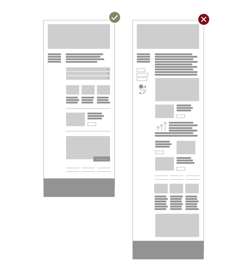
Set Clear Calls to Action

Don't ask visitors to read a paragraph to find the link to register. Your calls to action should stand out clearly from your content, making it easy for users to take the next step. When using buttons, be specific and avoid vague calls to action. 

Two call-to-action action buttons, one with a green check mark that says “Register for Reunions” and one with a red X that says “Click Here.”

Content Presentation

Showcase What Matters Most

Organize and showcase your most relevant content upfront. Prominently highlight your website's key functionalities and unique selling points.

Write Effectively: Be Clear and Concise

Keep your text short and to the point. Use scannable layouts with multiple heading levels, visual elements, and bulleted lists that break the flow of uniform text blocks. Use plain and objective language to ensure your message is clear.

Two graphics depicting website text, one with bullet points, line breaks, and a green check mark, and one with a dense paragraph of text and a red X.

Use Optimal Components

Align your content and components effectively. A feature panel works best for a few sentences, an image, and a link. For more detailed content, use a standard component and remember to break up the text with bullet points, images, and headings. Here’s an example illustrating how ineffective component usage can lead to a poor user experience:

Two graphics depicting webpages, one that has effective component usage and another that uses too many components.

Design and Accessibility

Follow Conventions (and User Expectations)

Conventional design doesn’t result in a boring website. In fact, conventions are useful: they reduce the learning curve, the need to figure out how things work, and they help to build confidence in the user and their trust in Reed.

Strive for Simplicity and Embrace White Space

Do the most with the least amount of cues and visual elements. Include only the elements that are most important for communication so the most important elements can be easily perceived. In general, users are not on our site to enjoy the design; in most cases they are looking for information despite the design. White space reduces cognitive load, helping visitors quickly scan and digest content by breaking it into manageable sections.

Refrain From Using Stacking Elements

Avoid stacking the same components on top of each other. For example, using multiple feature panels reduces the impact of each "feature" and extends the page's length, requiring users to scroll more (and risks losing their interest).

Avoid Graphics with Embedded Text

Graphics with embedded text can create accessibility issues for screen readers, limit SEO opportunities since search engines can’t read text in images, reduce scalability on different devices, add visual clutter, and make content harder to update or edit—all of which can negatively affect user experience.

Three graphics depicting webpages with improper accessibility and design components, each with a red “X” in the top right corner.

User Testing and Other Considerations

Test and Refine

According to Weinberg’s law, a developer is unsuited to test his or her code. This holds for designers as well. After you’ve worked on a site for few weeks, you can’t observe it from a fresh perspective anymore. You know how it is built and therefore you know exactly how it works—independent testers and visitors to your site are needed to understand whether the experience is clear, easy, and pleasant.

Consider Mobile vs. Desktop Views

Always design with both mobile and desktop users in mind. Approximately 1/3 of Reed website visitors in 2024 were on a mobile device. Mobile devices require more streamlined designs due to smaller screens, so ensure that content is easy to navigate and read on both platforms. A responsive design will improve user experience, reduce bounce rates, and increase engagement across all devices.

Design with Maintenance in Mind

Review your website regularly for outdated text, images, and event promotions—all of which can create confusion and/or a negative impression for your users. Ensure that all information is up-to-date, accurate, and relevant. When designing, ensure that your choices are sustainable and manageable for long-term maintenance.

Photo Permissions, Brand Guidelines, and More

Visit the Photo Guidelines page for important information on photo permissions and image considerations. Visit the Graphic Standards for Design page for brand standards and other best practices.

Additional Tips & Assistance

Follow the best use cases for components to ensure optimal design and usability.

For help with creating new content using components or custom formats, email us at cascade@reed.edu. For significant site edits, please submit a web update form.