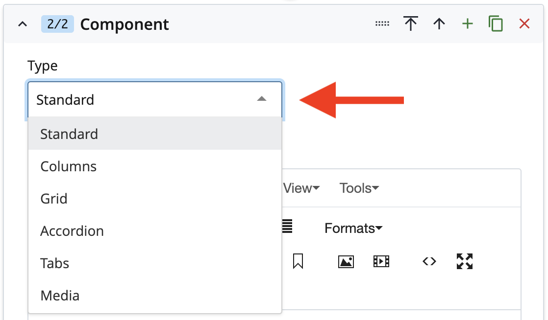
The main content area is made up of one or more Components. In the Type menu, select from among the various types to display your content in different ways: tabs, columns, and more.
Using Components
Learn about each component and how best to use them: