Best use
- Display a high-quality image with a strong headline and a short amount of text.
- Link or call to action is optional.
- Example: “Live with a Community of Scholars” on the Campus Life home page.
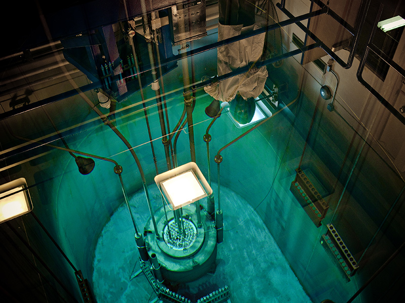
Feature Panel enables you to highlight your content while varying the look of a page, which helps with readability. It includes a large image next to a small amount of text.
- Keep your copy concise to avoid making the content area taller than the image.
- Use a heading of fewer than four words.
- Do not use more than two Feature Panels consecutively. See our design tips.
Once you’ve added your image and text, you can pick from a few design options. Set the background color to one of three preset options, or leave it set to “none” for a blank background. You can also set the image position to left, right, or behind the text content (note: when set to "Behind Content" the background color setting will have no effect).
Here’s an example with a blank background and an image to the left:

Heading
Lorem ipsum dolor sit amet, consectetur adipiscing elit. Ut feugiat lobortis odio a varius. Aenean porttitor dui elit, sit amet consequat massa sodales a.
Here’s an example with muliple images positioned behind the content:
It's also possible to create a panel with a solid color background and without images. To do this, choose a background color and don't add any images.
Heading
Lorem ipsum dolor sit amet, consectetur adipiscing elit. Ut feugiat lobortis odio a varius. Aenean porttitor dui elit, sit amet consequat massa sodales a.
